Content marketing is all about creating experiences. And a negative customer experience can be worse than no experience at all. But if you’re not prioritizing accessibility in your digital marketing campaigns, you’re all but guaranteeing that people with disabilities will not be able to enjoy the experience you’re trying to create.
A recent study that examined the home pages of the top one million websites worldwide found that 97% had detectable WCAG 2.0 violations. Only 3% of the world’s most popular websites offered a fully accessible experience to all users.
How do you think your marketing content stacks up?
Inclusive Marketing Matters
More and more, organizations are making accessibility and inclusive marketing a priority. The reasons behind this trend range from a genuine commitment to making sure everyone can access and enjoy content marketing teams create to preparing for — or in some cases, responding to — legal action over a lack of accessibility.
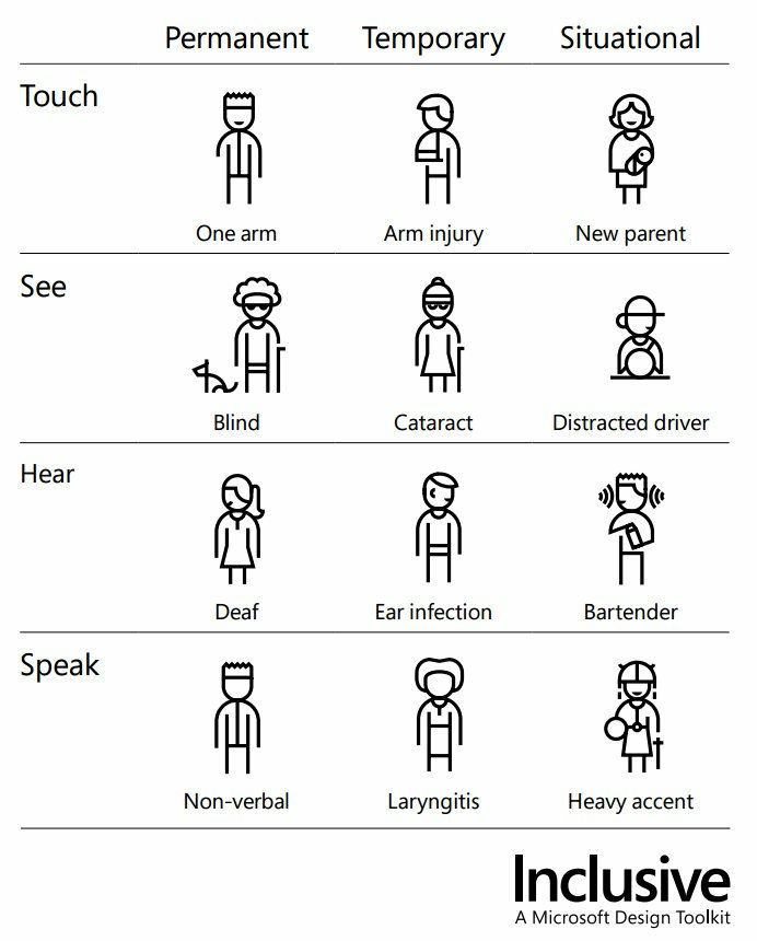
But regardless of what factors are driving your push for accessibility in digital marketing, it’s essential to understand the audience you’re serving. Most of us have moved past only thinking of accessibility in terms of physical access like wheelchair ramps and elevators, but making your message accessible goes far beyond serving people with permanent disabilities.

Accessibility in Marketing Guidelines
“Being locked out of the online world is the same as being locked out of the world.”

Writing Inclusive Copy
Whether you’re creating blog content, web copy, email sequences, or social media posts, it’s important to avoid using language that could exclude any part of your intended audience.
- Use white space. Breaking up walls of text with white space, headers, tables, and lists makes copy less overwhelming and easier to read. (This is a content marketing basic you should be doing whether you’re concerned about accessibility or not.)
- Avoid acronyms or technical jargon. If your subject matter requires either, make sure to use plain language that makes it clear what you’re talking about, and always spell out acronyms on first use. (Tools like Grammarly or Hemingway can let you know if your copy is getting hard to read.)
- Be respectful. Don’t use terms that could be considered derogatory or that have negative connotations about any specific group of people. Language is always evolving, so this will require you to make an effort to stay current.
- Make hyperlinks transparent. A link that simply says “click here” doesn’t let your audience know what to expect. Your anchor text should clearly indicate where readers will end up when they click.
- Check for bias. Before you hit publish (or pass your copy on to an editor, design team, or whoever), review your text and make sure you haven’t made assumptions — intentionally or otherwise — about your audience’s ability, gender, or background. (This can include some pretty common phrases, so be careful.)
Designing for Accessibility
Your design and development teams should also play a major role in building accessibility into your digital marketing campaigns.
- Use clean, clear layouts. Structure, space, and contrast can help users locate what they’re looking for and make long pieces of text easier to read.

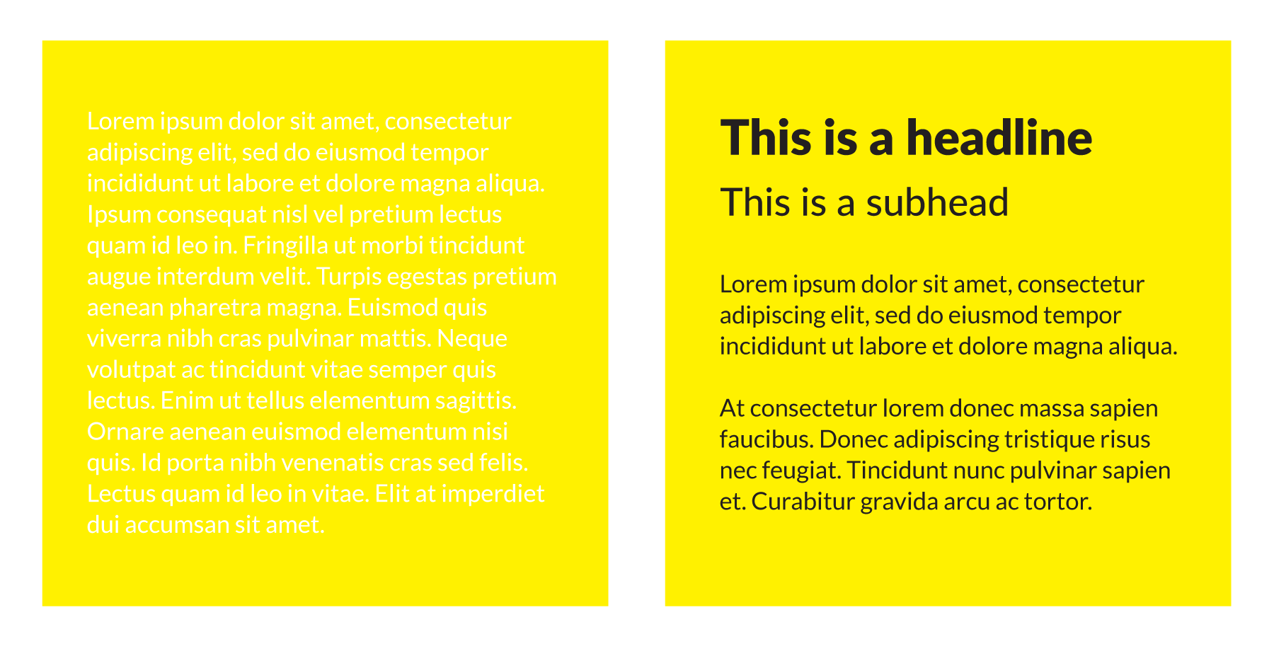
- Don’t hide things with colour. Colour can definitely punch up your design, but certain combinations of font and background colours can be difficult to read. Use a colour contrast of at least 4.5:1 to ensure users can comfortably navigate and consume your digital assets.
- Describe videos and images. All photos or images in your digital marketing campaigns should include alt text that clearly conveys what is depicted. (Alt text that says something vague like “image of a graph” doesn’t really improve accessibility.) Transcribe any text that appears in images, and make sure all video content includes a description and closed captions.
Posting on Social Media
The rules for accessibility in copy and design apply on social media, but platforms like Facebook, Twitter, and others also have some special guidelines that don’t come up elsewhere.
-
Hashtags
#checkouttpmsaccessibilitygame is pretty hard to read and will definitely increase the chances of confusion for people using screen readers or other accessibility devices. Keep hashtags simple. If you must use a longer hashtag, use camelcase to make it easier to decipher. #DoingAccessibilityRight -
Emojis
Using emojis in place of text is cute, but can also obscure your meaning and make your post harder to understand. Emojis to enhance your text are great; emojis as text are not cool. -
Specialty fonts and characters
Have you ever heard a screen reader try to interpret a Tweet that uses lots of italicized, bold, or specialty fonts? You don’t want to.
You 𝘵𝘩𝘪𝘯𝘬 it's 𝒸𝓊𝓉ℯ to 𝘄𝗿𝗶𝘁𝗲 your tweets and usernames 𝖙𝖍𝖎𝖘 𝖜𝖆𝖞. But have you 𝙡𝙞𝙨𝙩𝙚𝙣𝙚𝙙 to what it 𝘴𝘰𝘶𝘯𝘥𝘴 𝘭𝘪𝘬𝘦 with assistive technologies like 𝓥𝓸𝓲𝓬𝓮𝓞𝓿𝓮𝓻? pic.twitter.com/CywCf1b3Lm
— Kent C. Dodds 🌌 (@kentcdodds) January 9, 2019

Digital Accessibility is an Ongoing Process
Stress testing
Audience feedback
Accessibility tools
Training
Consider regular training on accessibility in digital marketing for your team. Our partners at Level Access offer a range of excellent programs to help keep your organization current and compliant.
We Understand Accessibility in Digital Marketing
Struggling to create accessible content that engages and educates your entire audience? TPM creates marketing collateral, sales enablement content, and educational material to help grow your reach, build trust, and generate leads. Get in touch to discuss how we can help you.
