
“If you can’t measure it, you can’t manage it.”
What is GA4?

-
Number of visitors
-
Demographics
-
Top-performing pages
GA4 vs. Universal Analytics
We’ve talked about what will stay the same in GA4 analytics reports. But what will be different?
The most significant change as Universal Analytics gives way to GA4 will be the shift away from sessions and a new focus on events. What does that mean? Essentially, UA data focused on specific “hits” in a session (page view, event, app/screen view, etc.). All of those will now fall under a single parameter in GA4: the “event.”
This change puts a greater emphasis on users’ engagement with a website — removing the disconnect between data on users and websites. Multiple hits that an event triggers to a website can increase data accuracy and better describe user behaviour.
This chart simplifies the changes you’ll see when moving from UA to GA4.

Google Analytics Bounce Rate vs. GA4 Engagement Rate
Average Time on Page vs. Average Engagement Time
The biggest problem with Average Time on Page (and Average Session Duration) in Universal Analytics was that duration for single page visits was considered 0 because there was no session parameter that tracked activity within a single page. With GA4, event-based data allows for a more accurate representation with parameters such as User Engagement and Scroll.
Which GA4 Reports Do You Need?
1. User Acquisition
- Where did they first find out about your site?
- Which channel did they enter from?
- How much are new users engaging with your website?
2. Traffic Acquisition

3. Pages and Screens
4. Engagement Overview Report
For example:
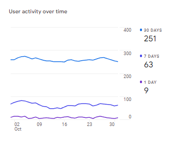
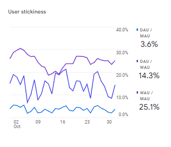
In the past month (30 days), your website or app has had 5000 active users daily.
- Your MAU = 5000
On day 30 (present-day), you also have 5000 users
- Your DAU = 5000
Your DAU/MAU is thus 100%, meaning 100% of your users have been active every day of the month.
Typically a DAU/MAU of 100% is unrealistic. Not everyone will be interested in your product or service, and hardly anything provides value every day for everyone. For apps, DAU/MAU ratio of 20% is good, and 50%+ is world-class. Websites will typically see lower values, unless you offer a SaaS, PaaS, free tools, or provide new value each day.
The one problem with the Engagement Overview report, however, is that you do not get much insight into which users are retained or lost. For this, we move on to the next report.
5. Retention Report
User Retention by Cohort
- Cohort here means the day that the user was acquired
- Day 1 (or 7, or 30) tells you how many users that you acquired came back to your site after that many days (Day 0 is the day that the user was acquired)
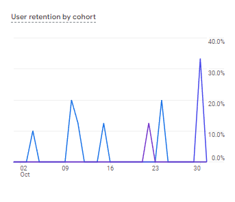
For example:
If you see on January 2 that your Day 1 user retention was 10%, 10% of your users from January 1 came back the following day. (The lower the value, the fewer users coming back.)
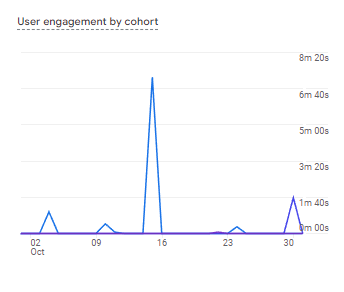
User Engagement by Cohort
- Similar to retention by cohort, but this lets you see how engaged returning users are on that day
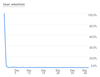
User Retention
- If you were a fan of Cohort Analysis (Beta) for Universal Analytics, this is the closest measurement on the default dashboard
- Lets you see the last X days of the percentage of new users who return
- A sharper fall-off closer to the left-hand side (day 0) signals poor retention of users
6. Other Reports
- Monetization: Allows you to set up ecommerce, in-app, and publisher ad metrics
- Demographics: Gives an overview of your users by location, typically outweighed by acquisition or engagement reports, layered on with a demographic filter
- Tech: An overview of users by operating system, platform, browser, screen resolution, device category, and apps
- Most dimensions work better as a filter layered on top of acquisition or engagement reports
- Screen resolution may provide the most value, used when optimizing image sizes on websites and testing for different screen sizes
Need Help Optimizing for GA4?
This post was only intended to cover the basics of getting started with Google Analytics 4, but there is much more to be uncovered. Although it may seem like a lot of UA features are being removed for GA4, the changes seem to simplify the entry process for the average user while providing advanced users with greater customization.
At Total Product Marketing, we have years of experience helping B2B tech companies optimize their websites, marketing content, and advertising campaigns to reach target audiences effectively and efficiently. We’re here to help you ensure your transition from Google Analytics to GA4 is seamless and pain-free. Reach out now to discuss what we can do for you.