4 Things to Look For When Building Your Partner Portal

Building Your Partner Portal

For any business selling through indirect sales channels, B2B partner marketing strategy is a critical component in your overall business strategy. But to fully succeed at partner marketing, businesses need the appropriate tools to ensure their partner relationships are being properly nurtured in an efficient way.

We recently wrote about co-branded partner marketing content, which is one strategy for building successful relationships with partners. In this post, we’ll discuss the role of a Partner Relationship Management (PRM) tool — or partner portal — in managing and maintaining relationships and measuring the success of your B2B partner marketing efforts.

What is a Partner Portal?

A partner portal is an online application designed to give B2B channel partners exclusive access to a number of resources, such as lead management tools, product information, and sales and marketing information and training.

Ultimately, a partner portal should aim to give partners all the information they need to increase their productivity and sales. This in turn creates efficiencies for your business as partners can self-serve and all efforts are tracked and measurable.

4 Things to Look For When Building Your Partner Portal

Now that we’ve covered what a partner portal is, it’s time to look at what it takes to build one. While every partner portal will be unique to the business behind it, there are several key characteristics that are essential to a quality partner portal.

Before setting off to build your own, be sure to design these 4 characteristics into your partner portal:

1. Seamless User Experience: Provides an easy journey for the user across all touchpoints.

Like any online site, the success of a partner portal will be determined by the site’s overall user experience (UX). A portal that’s designed with good UX principles will deliver a seamless experience that allows users to easily navigate your portal. Further, good UX makes it easy for users to find what they need from your site. Bad UX, on the other hand, makes it difficult for users to move throughout your site and retrieve information, which will likely make them frustrated enough to leave your site.

Seamless UX design was a large driver in our work on the Intelisys Cloud Services University (iCSU) portal. For this project, we were tasked with creating a user journey that spanned three different user touchpoints: Intelisys’ internal user hub, the iCSU main portal, and a learning management system where all resources and training information are stored.

Intelisys Cloud Services University

Intelisys’ iCSU provides a seamless experience for users as they navigate the three main learning and resource platforms.

From the get-go, we realized that our design would have to create a seamless journey for the user that allows them to navigate between all three touchpoints with zero friction. Users needed to access resources, pay for training, and view their individual dashboards with as few clicks as possible.

The result was a frictionless user experience that enabled Intelisys to keep their partners highly engaged with meaningful content and resources.

2. Measurable: Easily demonstrates the value of your B2B marketing efforts.

A best-in-class partner portal should be designed to provide you with actionable insights that show you where your partner content is performing well and where it needs improvement. With accurate insights in hand, you can improve your resources where needed to increase your partners’ sales effectiveness.

A few metrics platforms that we favour here at TPM are Kissmetrics and MixPanel. Our work on the iCSU project, for example, incorporated Kissmetrics’ platform, which allowed us to track visitors on the iCSU site. This tool was especially helpful in showing us what most piqued visitor interest (and potentially led them to sign up for iCSU). Kissmetrics also enabled us to see in real time which resources iCSU users were accessing most (and which were being ignored). With this information in hand, Intelisys was able to quickly adjust their content offerings to provide users and visitors with the best experience possible.

Similarly, for our work on Rapidscale’s partner portal, we used analytics platform MixPanel, which enabled us to gain deep insights into user activity across the site. Like Intelisys, this intel gave Rapidscale rich insight into how to best optimize their site for a better user experience.

We should note that given the vast data collected through metrics and analytics platforms, caution must be exercised to ensure user privacy is maintained at all times.

3. Easy Navigation: Make it easy for partners to find what they need.

A partner portal is only as effective as the experience it offers users. And a well-designed navigation system is key to creating a great experience.

Keep in mind that your portal is likely not the only partner portal your partners have access to. Therefore, it’s essential that your portal gives your partners fast access to the resources they need. If your portal is hard to navigate, there’s a good chance your partners will pass your portal by and favor better-designed portals offered by your competitors.

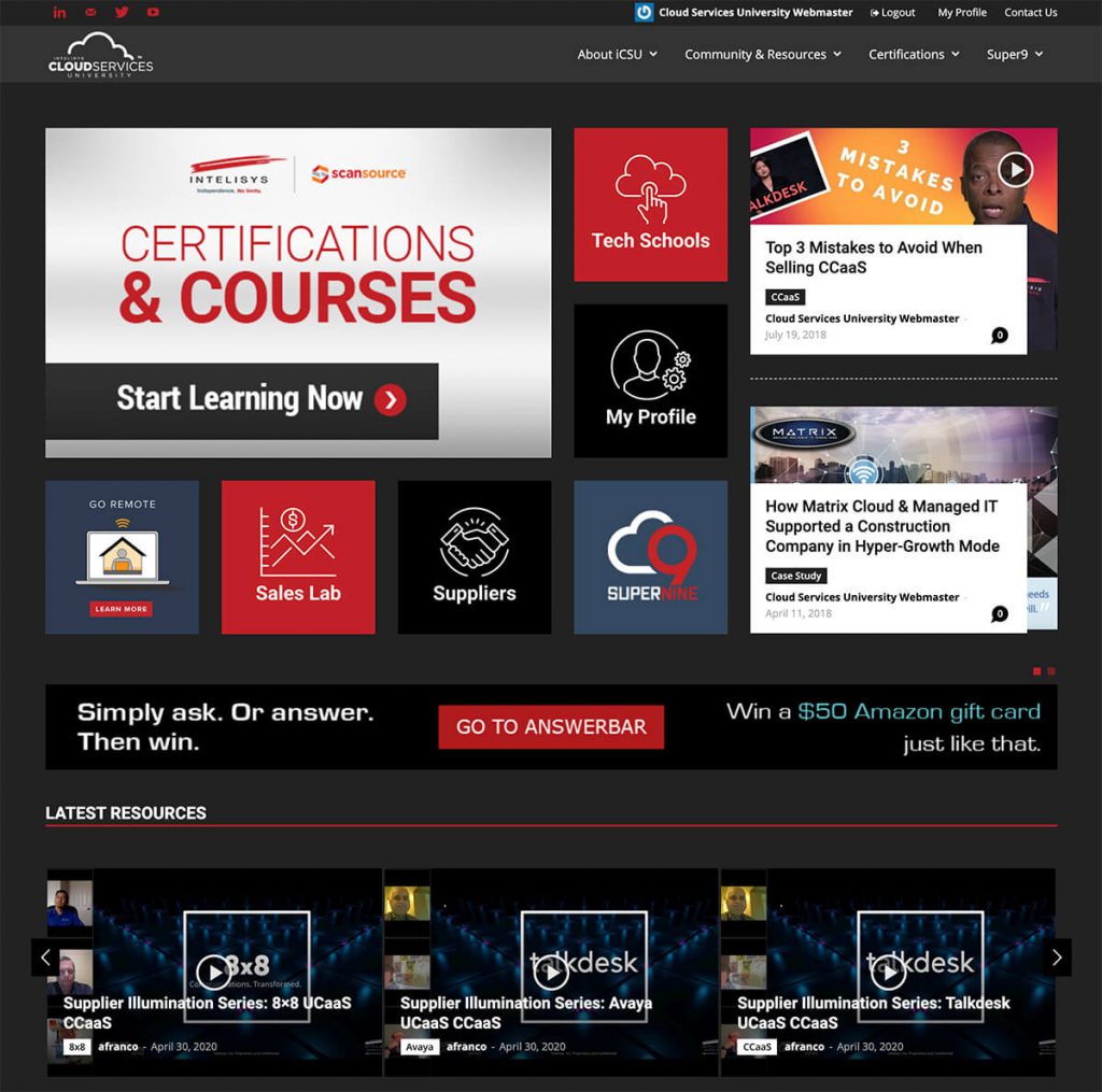
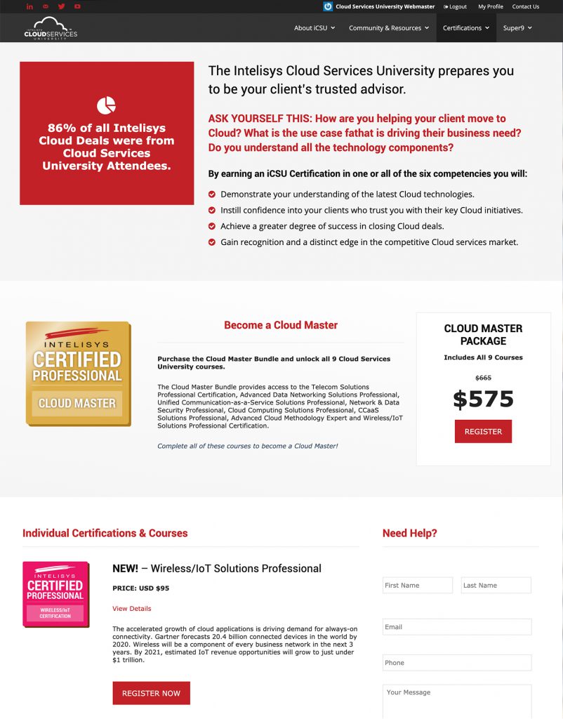
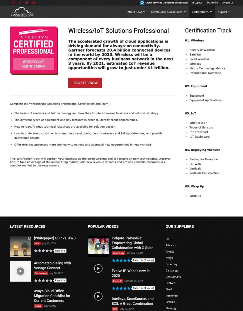
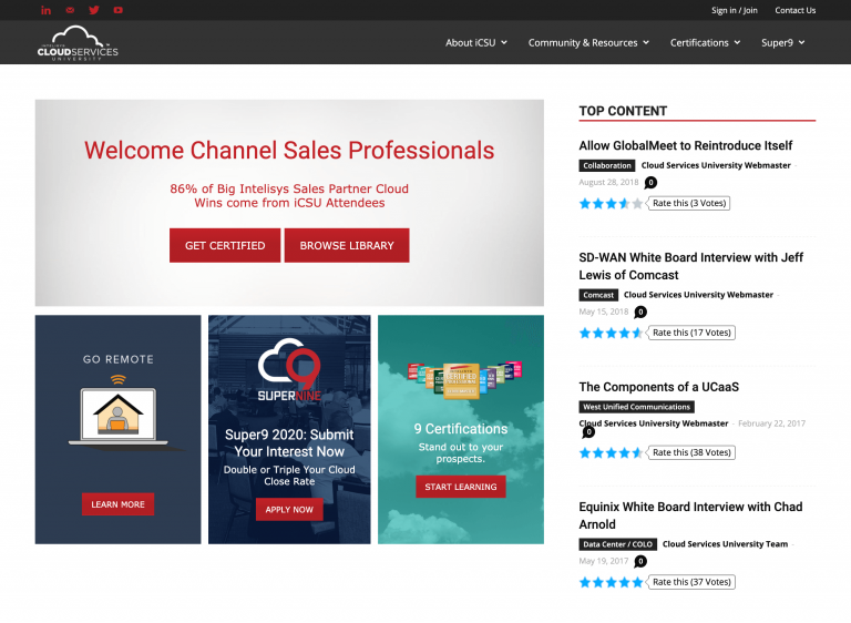
Starting at your homepage, give quick links to the content your partners need most, such as a resource library, training and certification, and channel events.

ICSU-homepage

Ultimately, navigation must be designed with the user’s experience in mind. In other words, and as counter-intuitive as this sounds, the navigation’s primary audience is not the company selling the product or service. After all, without a happy user, there will be no sale.

Here are a few things we keep in mind at TPM when building a site’s navigation:

4. Balance Form and Function: Make it look nice without compromising function.

Here at TPM, we approach our site design projects with a keen desire to balance form and function. That is to say, we design sites that look nice without compromising functionality and the user experience.

While our clients’ tastes certainly vary, our job as designers is to use our expertise to create an end product that delivers a great user experience (and a great outcome for our clients).

To achieve this, regardless of the project, our designs balance clean aesthetics with well-structured functionality that together give the user an easy experience. When designed in tandem, form and function are the surest way to deliver a project that looks and works great and ultimately leaves the user coming back for more.

Partner Portal Use Case: Cloud Services University

TPM was instrumental in designing and developing the most comprehensive sales partner-focused Cloud Service University in North America today. Known as the Intelisys Cloud Services University, the partner portal trains and enables cloud resellers to drive cloud sales in enterprises around the world.

Much more than a basic portal, iCSU brings together a vast number of channel sellers into a rich multi-platform experience that allows them to collaborate, learn, and gain the tools they need to sell more effectively.

TPM spent hours with the Intelisys team examining usability, copy, messaging, colors, and image placement to remove all friction from the site and create a great experience for the Intelisys team and their partners.

Intelisys Cloud Services University

Simple graphics and text create a visually appealing experience that enables smooth navigation for the Intelisys Cloud Services University

If you need help with your partner marketing strategies or you’re considering a partner portal for your team, reach out to us today. TPM has worked on numerous partner strategy projects and portals and can provide you with expert advice to supercharge your partner marketing strategy.

Right now, how comfortable are you with the idea of using AI-generated content (with minimal or no human intervention) to promote your business?

How comfortable are you with the idea of using AI-generated content